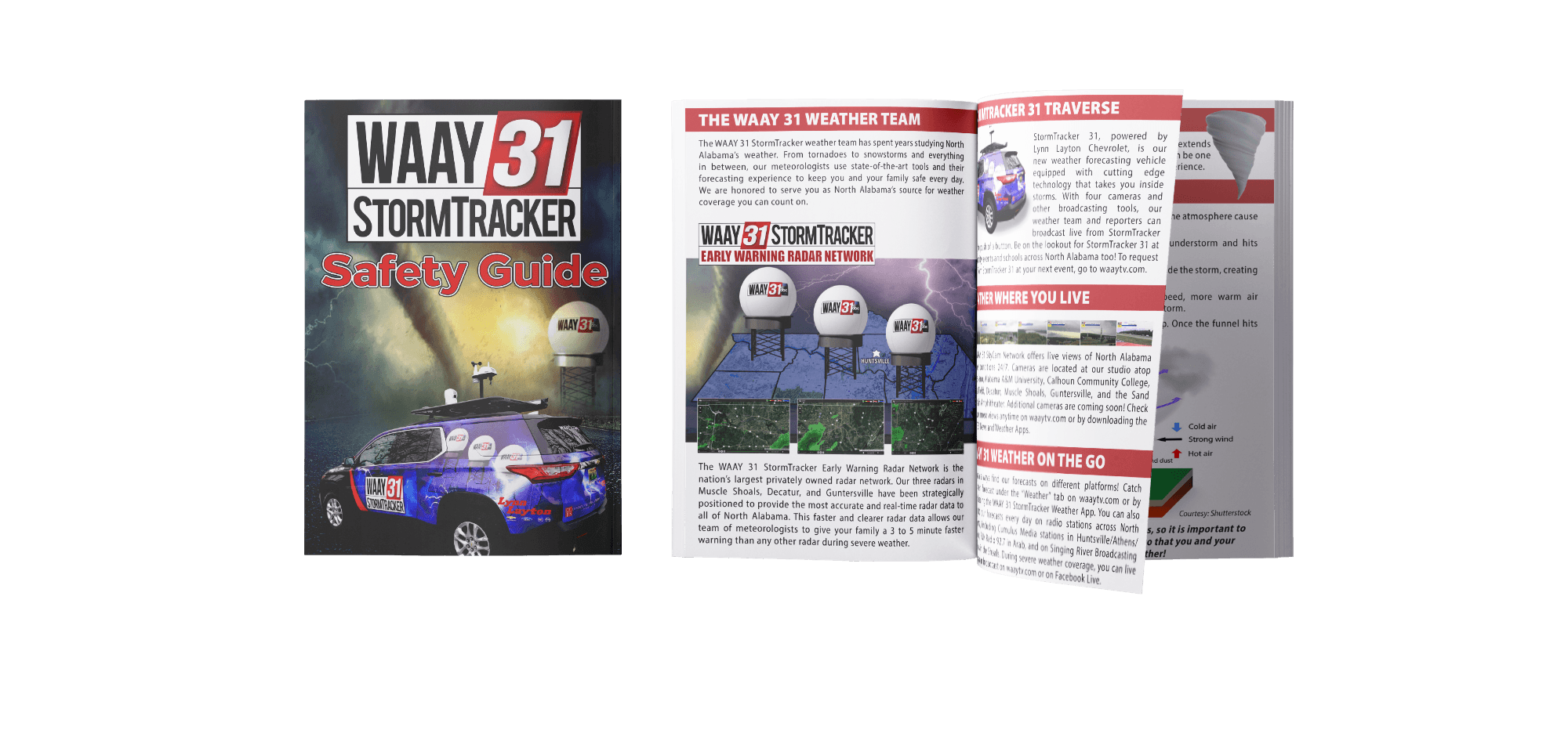
WAAY 31 StormTracker Safety Guide
WAAY 31 is a trusted source for local news and meteorology, serving Huntsville and the greater North Alabama area. Known for its strong focus on local stories and comprehensive weather coverage, the station plays a vital role in a region often affected by severe weather. As part of their new graphics and marketing package, WAAY 31 focused extensively on reworking the sub-brand, WAAY 31 StormTracker. Part of this effort includes the WAAY 31 StormTracker Safety Guide, which helps families, schools, and organizations prepare for severe weather.
Scope
Timeline
Editorial Design
July 2023 - October 2023
Tied to the broader initiative of increasing visibility of the meteorology team, the station began making regular visits to schools in the area. This outreach transitioned the end user from a broad demographic to a more tailored experience for younger students.
To support this, three key areas for the project needed to be researched and refinement before entering the ideation phase.
The problem
Ideation
Iteration
final Design
Research
While the existing StormTracker Safety Guide aimed to provide crucial information about weather safety, it featured elements of an older version of WAAY 31 that no longer aligned with the company's overall vision.
This provided us with a valuable opportunity: How can the guide be reimagined to better align with WAAY 31 and effectively meet the needs of communities across North Alabama?
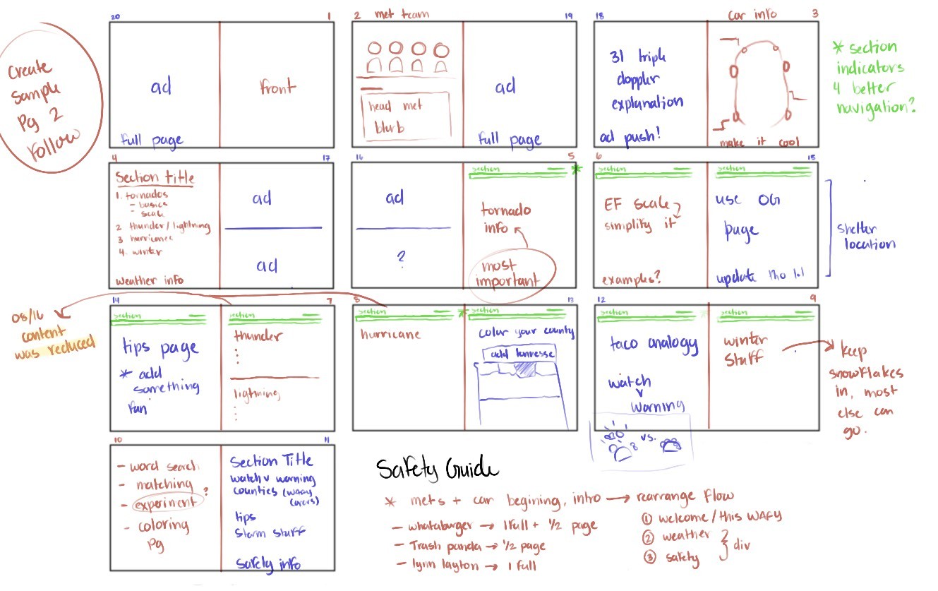
Early layout decisions focused on organizing the content in a way that followed the conclusions of the research, such as segmenting out similar information into categorical sections while ensuring it was grouped correctly come time for production.
After the initial layout plan, the focus shifted to refining a single-page frame to serve as a foundation for the subsequent spread. Additionally, three typography combinations were selected to test how they would interact within the page's composition.
Competing educational material often leaned too heavily on either playfulness or formalities, making them uninviting to a younger audience. Stakeholders also noted the need to align with WAAY31’s brand refresh without overshadowing the guide’s purpose.
vISUAL dIRECTION
Research into early reading development highlighted that younger demographics heavily rely on visual cues, predictable text patterns, and clear characters to process longer passages.
LITERACY
Initial reviews of the original guide revealed that the content was packed, with little hierarchy or progression. This created a lack of comprehension and retention in younger readers, especially those unfamiliar with weather concepts.
STRUCTURE

To assist in building out this templating, a greyscale wireframe was implemented to refine the page structure into clear, defined work zones. Once it reached the phase of importing text, the issue arose of narrowing down a combination of fonts; above are the three final choices. Each was given a mock page to allow for weight, caps, and spacing to be designed before the final was selected.
Not seen is the final choice, Roboto and Montserrat. The pair was selected for their neutral design and generous counter, as it allowed readers to distinguish letterforms easily, while also aligning with WAAY 31's motion to modernize their visuals overall.